Painting a Room in Gray - Picking the Perfect Color
In general, I have always leaned towards painting a room in warm beige tones.
For those of you that are familiar with my own home design, you will recall it is filled with warm beige walls.
For those of you that are familiar with my own home design, you will recall it is filled with warm beige walls.

Even though I personally learn towards the beige tones, love it or hate it, there's no denying that gray has come into the design world to replace beige as the new "It" neutral. I have to admit, the more I see gray used, the more I like it!
My last two design clients have wanted to paint their interior gray. I ALWAYS recommend painting test strips so you can see a larger swatch and how the time of day effects the paint color.
If you are worried about painting the room and having it look like Seattle ;-) just be sure to choose one that has a warm undertone. (a red, instead of a cold blue base) I can get away with talking about Seattle looking DREARY because I lived there for 20 years :-) (Yes, you can click the link to see all the places I have lived and how I enjoyed each one.)
 |
| This client chose Gray Matters by Sherwin Williams - it was very nice and had a warm undertone. |
The client above was the same client that I just finished the American Clay application for. So far, there is not ANY American Clay color I haven't loved, but seeing the clay in a gray tone instead of a warm, familiar beige tone was surprisingly beautiful.
 |
| Chesapeake Bay American Clay (with a bit of snow canyon mixed in too) |
Here is a list of some of my favorite gray paint colors to get you started. It can be intimidating trying to find the perfect gray for your home interior. /-: (and that's why I'm here to help!)
Rockport Gray

Sherry from YHL describes: Rockport Gray is an awesome moody gray tone with some mocha in it. I love how it’s both warm and cool and since it’s darker than the more airy greige tones, it feels more smoky and sophisticated – and really pops with white trim. We used it in our bedroom.
Next gray paint is Revere Pewter. It is the #1 searched for on Benjamin Moore's website. It is such a classic gray and goes with just about anything.
 |
| Benjamin Moore |
My other client choose Litchfield Gray by Sherwin Williams.
Another gray that goes with just about anything. It has just a hint of warmth.....very nice.

And like always, it's fun to see a little eye candy of others using the color gray even in furniture! I LOVE it when I see gray mixed with a bright and bold color like the samples below.
Gray with RED accents.
 |
| A Girl and a Brush How about gray with YELLOW accents!  Or a little girls room done in gray with PINK accents (super sweet!) 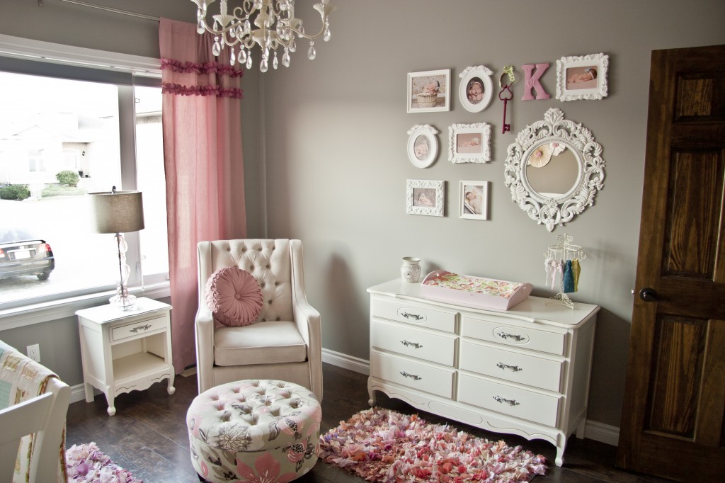 And lastly, gray stripes with bright turquoise accents.  What are your thoughts on the Oh-So-Popular color gray trend? Still prefer beige or head over heels about the latest "it" neutral? :-) Or maybe you are like me, and love BOTH!  |


